The short answer is to match the mood of your words to a script family. Calligraphy works for emotional, flowing phrases. Typewriter fonts suit clean, understated text. Old English fits bold, short statements. And custom hand-lettering gives you something entirely original. The style you pick shapes how your tattoo reads, feels, and ages on your skin.
But most people don’t realize how much the lettering changes the meaning. Two people can tattoo the same phrase and walk away with completely different pieces depending on the script. So it deserves as much thought as the words themselves.
Why the Script Matters More Than the Words
A name written in hand-drawn calligraphy tells a different story than the same name printed in a clean sans-serif. The script sets the emotional tone of your tattoo before anyone reads a single word.
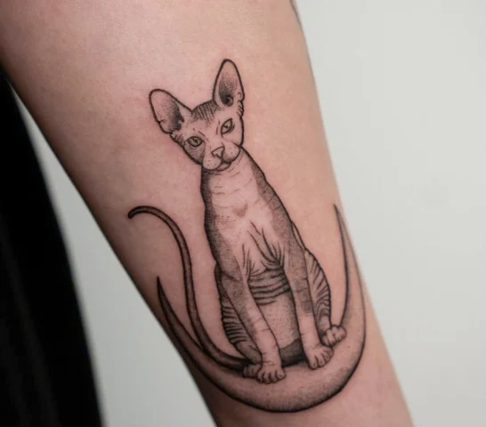
This is part of what makes fine line script and lettering so appealing right now, especially in NYC studios. Thin, careful strokes give the text a quality that feels intimate and intentional. The letters become part of the body instead of sitting on top of it. Getting there, though, means thinking past generic fonts and into the territory of real design.
The Best Script Styles for Tattoos, Explained
Not all lettering tattoos fall into the same category. Knowing the major style families helps you communicate what you want during a consultation, and it keeps you from scrolling Pinterest for hours without getting any closer to a decision.
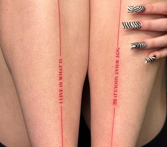
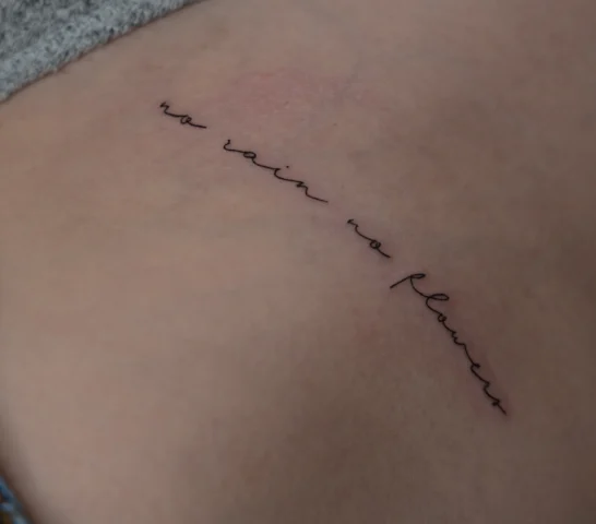
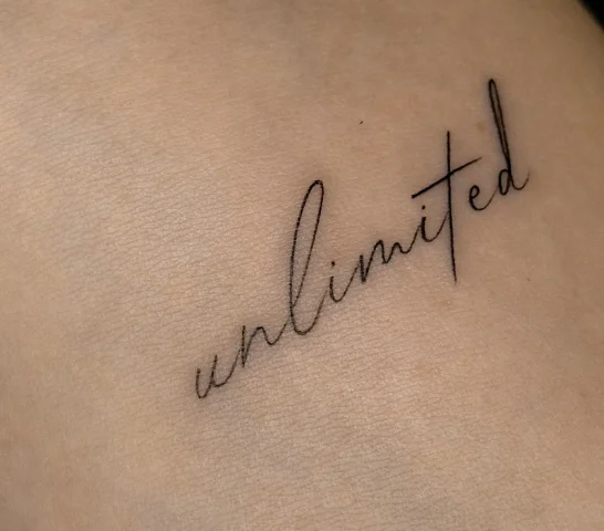
Fine Line Calligraphy and Cursive
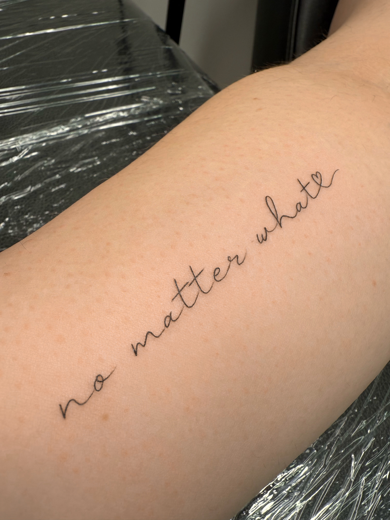
Flowing, connected letterforms with thick-to-thin stroke variation. This family is ideal for names, single meaningful words, and short emotional phrases. A skilled artist who does custom lettering work will often draw these by hand rather than pulling from a digital font library, because hand-drawn calligraphy adapts to the curve of your body in ways a template cannot.
Fine line calligraphy tattoos are especially popular for rib placements, collarbones, and inner arms where the script can follow the natural line of the body.
Minimalist Typewriter Font Tattoos
If calligraphy feels too ornate, typewriter-style lettering offers the opposite. Clean, uniform, lowercase letters that look stamped onto the skin. They work well for short quotes, dates, and single words. No flourish, no decoration. The text speaks for itself.
This style also pairs well with other fine line elements like small botanicals or geometric shapes. A typed word next to an illustration creates a balanced, modern composition without either piece competing for attention.
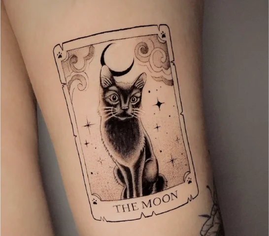
Traditional and Old English
Bold, structured letterforms like Old English, Gothic, and Blackletter have been part of tattoo culture for decades. These scripts carry heavier visual weight and work best for shorter words, single letters, or knuckle tattoos. Fonts like Cambridge, Trattatello, and Engravers fall into this family, though many artists prefer to hand-draw them for a more organic result.
Chicano Script
Chicano-style lettering has roots in Mexican American tattoo culture and is known for distinctive bold letters that taper into a swirl. Historically tied to themes of family, loyalty, and remembrance, this style carries real cultural weight. It reads well at larger sizes and pairs naturally with illustrative elements like roses or portraits.
Custom Hand-Lettering
The most personal option is having your artist create the script from scratch. No existing font, no template. The letterforms are designed around your piece specifically, blending elements from several style families if needed. Hand-lettered tattoos give you something no one else has, and they tend to age well because the artist accounts for how the ink will settle over time.
Tattoo Fonts for Names, Quotes, and Dates
Different content calls for different scripts. For a single name or a short date, almost any style will work. For longer quotes, readability becomes the priority. A flowing cursive can lose clarity past a certain length, especially at smaller sizes, so a cleaner structure helps with longer text.
Name tattoos can also reflect the personality of the person they honor. If they were creative, an italic or freehand script might suit them. If you have an old birthday card or a note in their handwriting, your artist can build a design around that. Some people weave initials into a floral composition for a more layered tribute.
Roman numerals pair naturally with serif or traditional fonts. Standard digits tend to look strongest in minimalist or hand-lettered styles. Georgia and Copperplate Gothic handle the structure of Roman numeral characters especially well.
How Small Can Lettering Go Before It Becomes Unreadable
Script tattoos interact with the body differently than image-based designs. The angle of the text, the direction it reads, and the curve of the surface all affect how the piece holds up over time.
There is a real lower limit on how small lettering can go. Letters with closed shapes like “a,” “e,” and “o” will gradually fill in as the tattoo ages if they are too small. If you have to strain to read the design on paper from an arm’s length away, it is probably too small for skin. A good artist will be upfront about this during your consultation rather than letting you walk out with something that won’t last.
What to Bring to Your Lettering Tattoo Consultation in NYC
Start gathering reference images of styles you are drawn to, even if they are not tattoos. Signage, book covers, handwritten notes, and typography from packaging can all serve as starting points. The more visual references you bring, the easier it is for your artist to understand your taste and create something tailored to you.
Triple-check the spelling and wording before your appointment day. Small errors in dates, accents on foreign words, or misspelled names happen more often than you’d think. Write it out clearly and confirm it with someone else ahead of time. If you have a specific handwriting sample you want to use, like a note from a loved one, bring a clean photo or scan. That kind of piece carries a meaning no font can replicate.