The choice between a color tattoo and a black and gray tattoo comes down to more than personal taste. Your skin tone, the style you want, and how you expect the piece to look years from now all play a role. This guide breaks down the key differences so you can walk into your consultation with a clear idea of what will work best for you.
It Starts With a Gut Feeling, but It Should Not End There
Most people start with a gut feeling. They either picture their tattoo in vivid hues or imagine it in soft gradients of gray. Both instincts are valid, but the final choice should also account for how ink behaves on your specific skin and how the tattoo will hold up over time.
A color tattoo vs black and gray tattoo comparison is not about one being better than the other. Each palette has strengths that shine depending on the design, placement, and the person wearing it. The goal is to match the palette to your vision and your body.
How Skin Tone Changes the Way Color Shows Up
Ink sits beneath the top layer of skin, which means your natural pigmentation acts as a filter over every color in your tattoo. On lighter skin, a wide range of colors tends to read clearly, from pastels and yellows to deep reds and blues. On medium and olive tones, warm colors like orange, red, and deep green tend to hold their vibrancy well, while very light shades can lose definition over time.
Best Tattoo Colors for Dark Skin
For darker skin tones, bold and saturated colors produce the strongest results. Deep jewel tones like royal blue, emerald, magenta, and crimson create a striking contrast against rich melanin. Lighter shades like baby pink, light yellow, or white ink often fade or become difficult to see as the tattoo heals. A skilled artist will know how to adjust saturation levels and build contrast so that a color tattoo on different skin tones looks intentional and vibrant rather than washed out.
Do Color Tattoos Fade Faster Than Black and Gray
In general, yes. Black ink is the most stable pigment used in tattooing, which is why black and gray work tends to maintain its clarity longer. Color pigments, especially lighter ones like yellow, pink, and light blue, break down faster under UV exposure and through the natural cell turnover of your skin.
That said, the gap in longevity is not as dramatic as people assume. A well-executed color piece with quality ink, applied at the right depth, and cared for with consistent sun protection can look great for many years. How a tattoo ages depends heavily on aftercare and sun habits, not only on the palette.
Color Tattoo vs Black and Grey Longevity
If you are asking which tattoo style ages better, black and gray has the edge. These tattoos age with a softening effect. Lines may spread slightly, and shading can mellow, but the overall image stays readable. Color tattoos may need occasional touch-ups to restore vibrancy, particularly in areas that get frequent sun exposure like forearms and ankles. If low maintenance matters to you, black and gray is the more forgiving choice over the long run.
Which Tattoo Styles Work Best in Each Palette
Not every style translates equally well into both palettes. Here is a general breakdown.
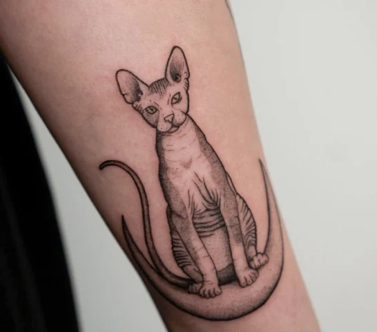
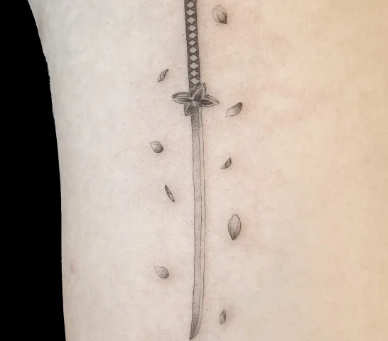
Styles That Favor Black and Gray
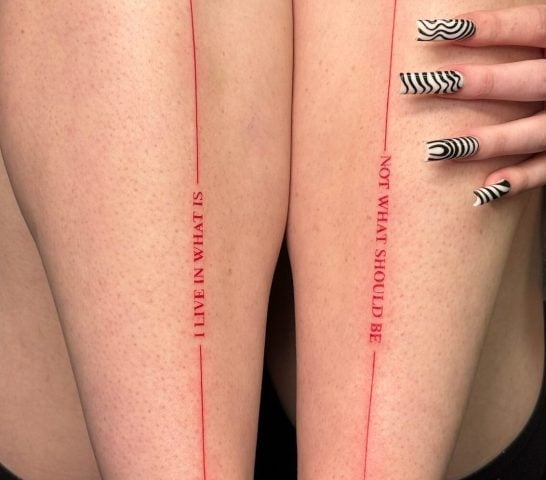
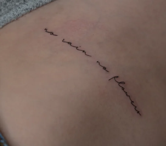
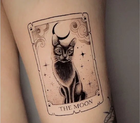
Fine line tattoos are most commonly done in black and gray because the thin single-needle work relies on clean contrast and delicate shading. Ornamental designs, geometric patterns, and script work also tend to read best without color competing for attention.
Styles That Favor Color
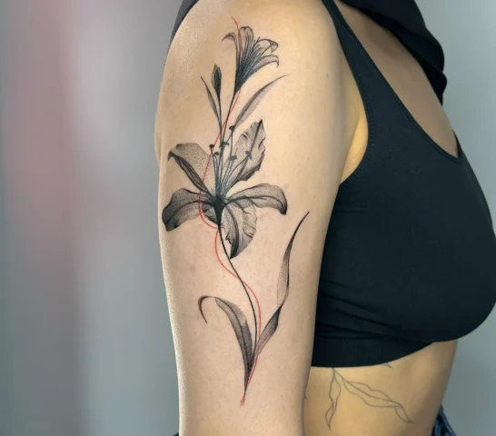
Watercolor tattoos depend entirely on color to achieve their painterly, bleeding-edge look. Neo-traditional work uses bold color palettes and thick outlines. Illustrative pieces and some floral designs also benefit from color when the goal is to capture the natural look of a flower or a scene.
Styles That Work in Both
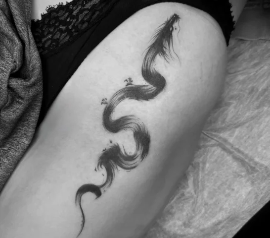
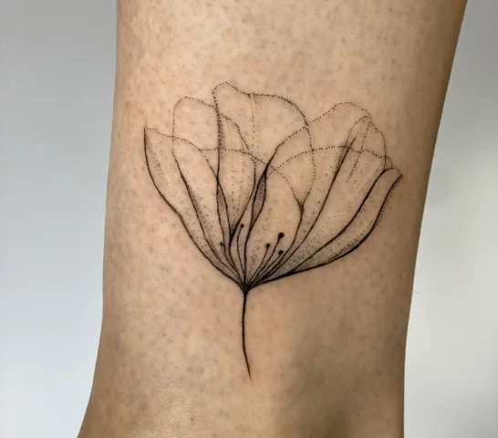
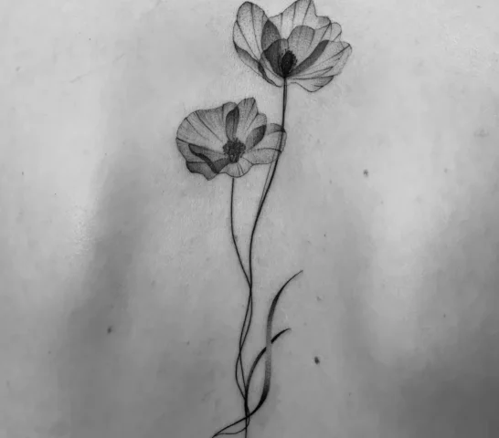
Micro-realism translates beautifully into either palette. A black and gray portrait can feel cinematic, while a color portrait can feel almost photographic. The same goes for botanical tattoos and custom pieces where the client and artist decide together what palette serves the concept best.
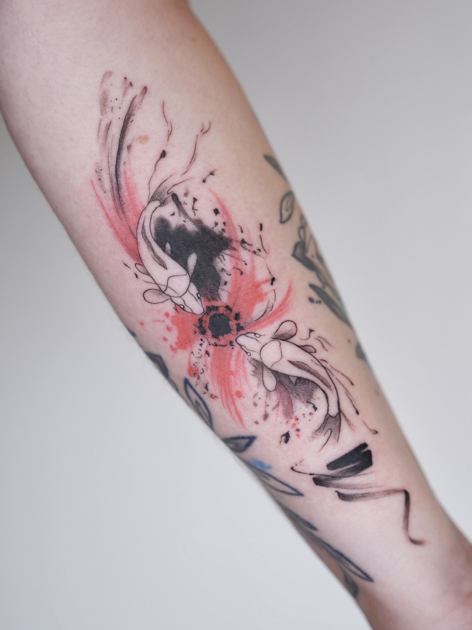
Mixing Palettes in a Single Design
You do not have to commit fully to one direction. Some of the most compelling tattoos combine a black and gray foundation with selective color accents. Think of a grayscale floral arrangement with a single red rose, or a black and gray portrait with blue eyes.
This approach gives you visual depth without overwhelming the design. It also lets the color elements hit harder because they are not competing with a full spectrum of hues. If you are considering a custom piece, mixing palettes is something worth discussing during your consultation.
Talking to Your Artist About Palette
The best time to discuss color vs black and gray is during your initial consultation. Bring reference images that reflect both the style and the palette you are drawn to. If you are undecided, your artist can mock up the same concept in both directions so you can compare.
Be open about your skin tone concerns. A good artist will give you honest feedback about which colors will read well on your skin and which ones might lose impact over time. This is especially important if you have darker skin and want vibrant color work, because the approach to saturation and contrast will differ from what works on lighter tones.
If you have a concept in mind and want to talk through your options, you can request an appointment to start the conversation with an artist who works in both palettes.