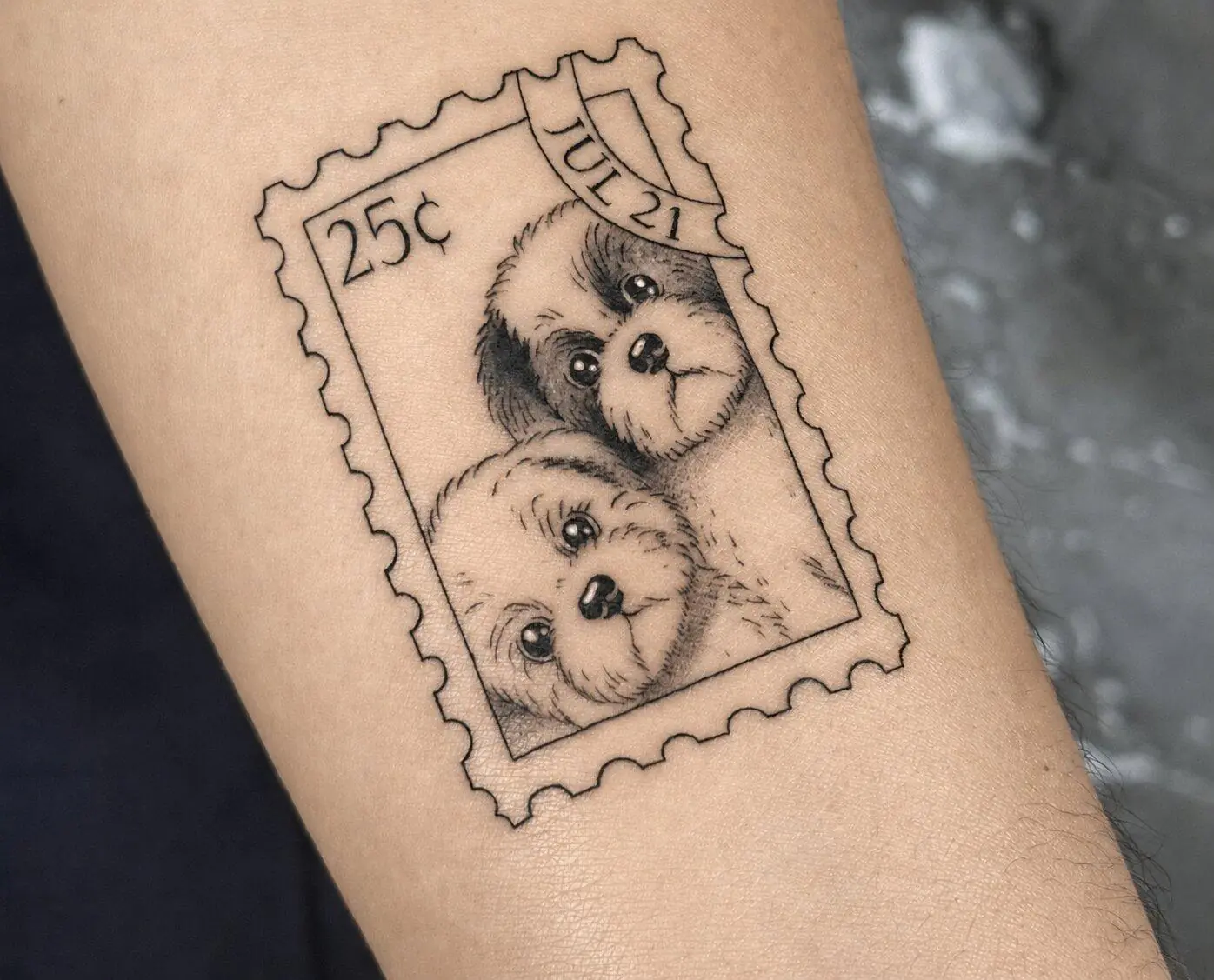
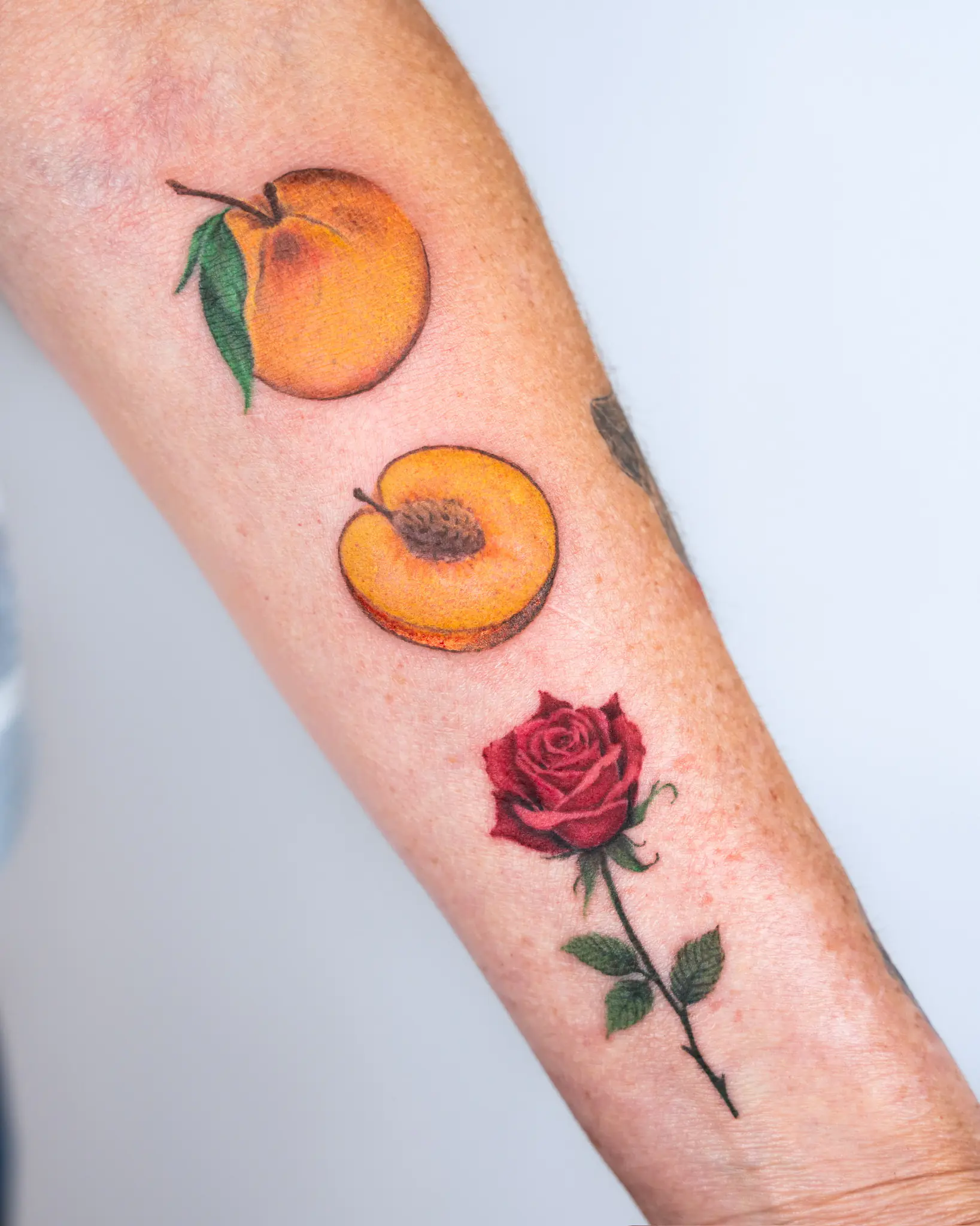
Fine line does not automatically mean black ink. A lot of people still think of it that way though.
Black gives a cleaner, quieter result. Color changes the whole feel pretty fast. Even one small red detail inside a flower can shift what your eye notices first.
So which one is better?
Depends on the tattoo. Also your skin. Also how much visual softness you actually want.
A color fine line tattoo can be barely there, honestly. Soft pink. One blue accent. A light wash inside a botanical piece. It does not need to look bright or heavily saturated.
And black can be simple too. Very clean. Very direct.
Neither one wins automatically.
How Color Changes the Look of Delicate Linework
Color adds another layer to the design.
That sounds obvious, but with fine line work the change can feel bigger because there is already so little visual weight.
Take a flower.
In black, maybe you notice the outline first. The shape. The spacing. Add soft color into the petals and now the tattoo reads differently. Your eye starts paying attention to tone and contrast too.
Our color work can include soft muted shades, brighter accents, watercolor-style washes, single-needle color details, and delicate shading in floral, ornamental, and illustrative pieces.
So a fine line color tattoo can go in a lot of directions.
Maybe you want:
- black linework with one colored section;
- a very light wash inside the design;
- one bright accent that actually gets noticed;
- soft colored lines instead of black;
- muted shading around a floral or illustrative piece.
This is where references become really useful.
Saying “I want pink” does not tell the artist much.
Dusty rose? Pale blush? Something brighter? Barely visible?
Those are different tattoos.
And with fine line, even small color changes can change the balance a lot. There is less going on visually, so every extra thing has more influence.
I would show the artist examples of color you like and then explain which part of the reference you actually care about.
Sometimes people show five different photos and say, “Like this.”
Like what, exactly?
The color? The line thickness? The softness? The placement?
Say it.
That saves a lot of guessing.
What to Consider Across Different Skin Tones
Color doesn’t stay on the surface of the skin like paint but rather goes inside the skin, thus, your natural tone affects how the pigment will look once it’s fully healed. That’s why the exact same shade looks different on two people with different skin tones.
A delicate color tattoo needs enough contrast to stay readable, but “contrast” does not mean the tattoo has to become dark or loud. It means the artist needs to think about how the pigment will actually show through your skin.
Start With the Color Family, Not the Exact Shade
Instead of saying, “I need this exact pink,” think pink more broadly first.
The artist can then look at the skin and make a more realistic call on how that family of color will behave.
A screenshot is not a guarantee.
Also, phone screens lie a little. Lighting lies too. Fresh tattoo photos definitely make colors look different than healed ones.
So if you are choosing color, do not get too attached to one exact digital shade.
Look at Healed Work
Fresh color can look very bright.
Then the skin heals over it. The whole thing settles. The result gets softer.
This is why healed examples are useful, especially with pale shades and very thin color work.
I would look at:
- how the color settled;
- if the tiny details still read;
- how much contrast stayed;
- how black and color sit together;
- if the piece still looks intentional once healed.
Not every artist posts lots of healed work, but if they do, look at it.
It tells you something different than a fresh photo.
Think About What Actually Needs Color
This part is easy to overdo.
Maybe the tattoo only needs one red flower. Maybe one blue eye. Maybe a soft green leaf.
The whole piece does not need color just because one detail does.
Sometimes black linework with one small color accent feels more balanced.
Sometimes full color is the whole point.
Depends on the idea.
How Black and Color Pigments Age Over Time
All tattoos change.
That includes black. Includes color. Includes very fine work.
Fresh tattoos, because they’re fresh, look sharp. With the new pigment and the skin that’s just been worked on, everything is usually stronger until the skin settles.
Over years, sunlight and normal skin changes affect how the tattoo looks too.
A black fine line tattoo may stay visually clearer for longer in some designs simply because black has strong contrast. That does not mean it is immune to fading. Thin lines can still soften.
Color behaves differently depending on the pigment itself.
Some shades are more stable than others. Some are intentionally light from the start. A soft wash can look softer after healing because that was already the design language.
That is not automatically bad healing.
A few things affect how both black and color tattoos age:
- sun exposure;
- placement;
- line density;
- how much detail is packed into a small space;
- the actual pigment used;
- healing;
- long-term skin changes.
Sun is the big obvious one.
UV exposure can fade tattoo pigment over time. Once the tattoo is fully healed, sunscreen helps protect the skin and the tattoo.
This matters more for placements that stay exposed a lot.
Forearms. Shoulders. Lower legs. Hands.
If you love one of those placements, fine. Just know what comes with it.
Color tattoos also make pigment choice more noticeable because different colors can age differently.
That is another reason I would not choose a color only because it looks nice in the bottle or on someone else’s skin.
The artist has to think about the whole design.
And honestly, for the black-versus-color decision, I would start with the actual idea before anything else.
A simple line drawing may already feel complete in black.
A flower could need color because the color is part of why you chose that flower in the first place.
A tiny portrait might use black and gray because too many colors would make the whole thing busier than you want.
There is no universal better option.
If you are unsure, bring the design in black first. Then talk through what changes if color gets added.
One accent.
Several tones.
Full color.
You can usually feel which version makes sense once you see the design and talk through the placement.
And if you still cannot decide, that is fine too. The artist can help you figure out how much color the piece actually needs, which is usually a better question anyway.