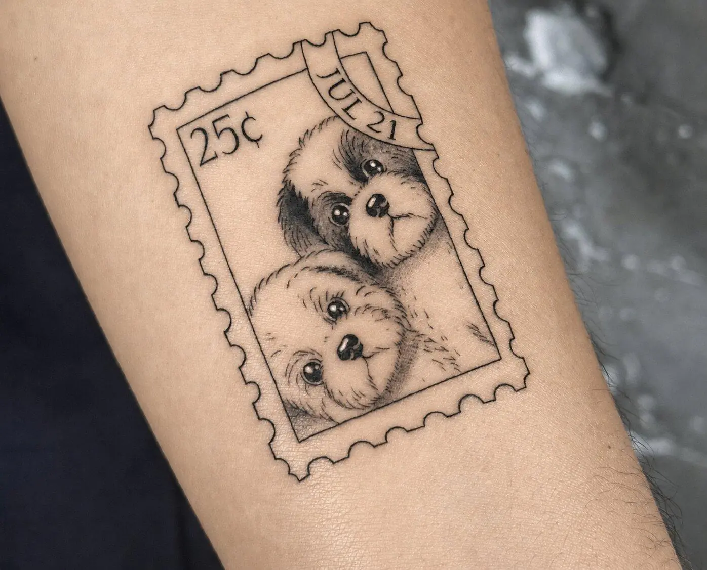

Fine line and microrealism often get confused because of their shared tiny and delicate structures. More than that, both might use single-needle techniques. They might even seem almost the same from a 5-second clip on Instagram.
They aren’t.
The fine line vs microrealism tattoo choice is really about what you want the finished project to do. Fine line can stay simple. Very simple, even. A flower outline. A date. A little symbol. Microrealism needs enough detail to end up recognizable and dimensional at such a small scale.
Although, there is overlap between the two. Quite a bit, too.
That is where people get confused.
How Technique, Detail, and Visual Impact Differ
Fine line is a bigger category than microrealism.
It is about thin, controlled linework. Single needles and ultra-fine techniques can be used, depending on the design. The finished tattoo might be minimal, ornamental, floral, script-based, geometric, or extremely detailed.
Microrealism has a more specific goal.
The artist is trying to make a very small image still look realistic. A face should still read as that person. A pet should still look like that pet. A tiny statue should still have shape, shadow, and dimension.
That takes more visual information.
A microrealism tattoo NYC client brings in may use fine-line techniques, yes. It may also include very soft shading, tiny tonal changes, texture, highlights, little transitions that almost disappear when you look at the tattoo from farther away.
Up close, though, they do a lot.
A rose is an easy example.
A fine line rose might have the outline of the petals, a few interior lines, maybe light shading. Clean. Open.
A microrealistic rose can show the folds inside the petals, shadow between layers, subtle depth, little texture changes.
Same flower.
Very different job for the artist.
Fine Line Does Not Automatically Mean “Detailed”
This is something people get wrong constantly. Even one tiny clean outline is still fine line. A complicated botanical piece with dozens of delicate marks is also fine line.
The line style itself doesn’t tell you how visually dense the tattoo is or has to be.
As mentioned previously, microrealism requires more information because the whole point of realism is recognition. Texture helps. Proportion helps. Tiny shadows. Small highlights. Even the details that you wouldn’t notice in a larger tattoo become really important in a compressed image.
Then there is fine line microrealism with the two techniques very close together. In this case, an artist might use extremely delicate linework with subtle shading to build a realistic small image. No heavy outline. No dramatic black areas. Still clearly realistic.
This is why I would never choose an artist based only on the style name in their bio.
Look at the actual tattoos.
Labels can get fuzzy fast.
Why Size Matters for Long-Term Results
Here is where things get slightly less fun.
Everyone loves tiny tattoos. Clients often want them even tinier once they see the stencil.
And sometimes that works.
Sometimes it really doesn’t.
Skin is not a piece of paper. A tattoo heals, settles, softens a little, then keeps aging along with your skin. Lines can change. Tiny spaces can become less obvious. Very close details may stop reading separately later.
Microrealism feels this more strongly because there is simply more information packed into a smaller area.
A miniature realism tattoo can still be small. Obviously. It just needs enough space for the details that make the image work.
Think about a portrait.
You need room for the eyes. Nose. Mouth. Shadows. Face shape. Small changes in value. If every one of those things gets squeezed into a ridiculously tiny area, the artist has almost no room left to separate them.
Fine line has similar problems, just in another form.
Tiny lettering can close up visually. Petals can crowd each other. Several decorative lines may sit too close.
I would pay attention to a few things:
- how many separate details are inside the design;
- how close those details sit;
- how much open skin exists between them;
- how readable the tattoo is at normal viewing distance;
- how much the artist wants to increase the size.
That last one. Listen to it.
If the artist says the design needs another half inch, there is usually a reason. Clients sometimes think, “But it looks fine this small on my phone.”
Yes. On a phone.
A phone screen is not skin.
And skin is going to keep being skin for a long time after your appointment ends.
Placement also affects scale. A design can feel spacious on the outer arm and suddenly cramped on the wrist. The same reference image may need a different size depending on where it goes.
So size should not be decided alone.
Design first. Placement. Then scale.
Much easier.
Tattoo Ideas That Work Best in Each Style
This is usually where the choice becomes obvious.
Forget the terminology for a second and think about what you actually want to see in the finished tattoo.
Some ideas work because of their shape.
Others work because of all the little information inside them.
Fine Line Is Great When the Shape Does Most of the Work
Fine line tends to make sense for things like:
- short lettering;
- names and dates;
- simple florals;
- botanical stems;
- small symbols;
- geometric designs;
- ornamental details;
- abstract shapes;
- clean animal outlines;
- simple objects.
The design can stay airy. Open.
You do not need to fill every part of it with shading or texture.
Sometimes the whole appeal is exactly that. A few thin lines, placed well, and done.
Microrealism Needs the Details You Actually Care About
Microrealism is stronger when the image becomes less meaningful if you remove the little details.
Portraits are the obvious one.
If you want your grandmother’s face, you probably care about her expression. Her eyes. The shape of her smile. Those tiny things are the reason the tattoo is her.
Same with pets.
A generic outline of a dog is one thing. Your dog’s exact face is another.
Microrealism also works well for:
- pet portraits;
- wildlife;
- eyes;
- sculptures;
- architecture;
- detailed flowers;
- watches and jewelry;
- meaningful objects;
- photographs translated into small tattoos;
- realistic symbols.
A camera could go either way.
Fine line version? Clean outline. Maybe a couple of details.
Microrealism? Lens reflections, buttons, texture, little shadows around the body.
Both can look good.
You are just asking for two different results.
This is basically how I would choose: what part of the reference do you actually love?
If it is the shape, the composition, the clean outline, then fine line makes sense.
If it is the texture, expression, tiny shadow, or exact resemblance, microrealism starts making more sense.
And sometimes you really are somewhere in the middle.
That is fine too.
Bring the reference. Show the artist the size you were imagining. Point out the parts you absolutely do not want to lose.
Then let them tell you what the design can realistically carry at that scale.
You do not need to arrive knowing the perfect technical label. You need to know what you want the tattoo to feel like when you look at it later. The artist can help with the rest.